Quickstart
Installation
pip install gander
Examples
import gander.indicators as gi
import gander.plotting as gp
import matplotlib.pyplot as plt
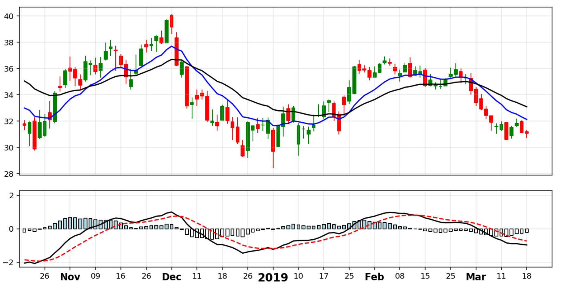
Using Matplotlib and Gander to create daily stock charts
Let’s say we have a Pandas DataFrame of a stocks data and we want to make a chart of a subset of the data. Our DataFrame might look something like this:

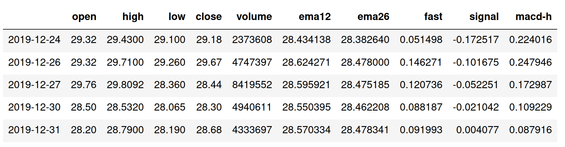
Adding indicators to the data set
df = gi.calc_ema(df, df["close"], "ema12", window=13)
df = gi.calc_ema(df, df["close"], "ema26", window=27)
df = gi.calc_macd(df, df["ema12"], df["ema26"])
This will give us something like this:
To get a subset of the data and positions on the x-axis, we can do:
df_plot = df[-300:-200]
xpos = range(100)
Building figure and subplots
fig = plt.figure(figsize=(12, 6))
ax1 = plt.subplot2grid((3, 1), (0, 0), rowspan=2)
ax2 = plt.subplot2grid((3, 1), (2, 0), rowspan=1)
ticks, labels = gp.daily_labels(df_plot, df_plot.index, step=5)
Customizing x-axis ticks, labels and grid
for ax in [ax1, ax2]:
    ax.set_xlim(xmin=-1, xmax=104)
    ax.set_xticks(ticks)
    ax.grid(alpha=0.3)

ax1.xaxis.set_ticklabels([])
ax1.tick_params(axis='x', length=0)
ax2.set_xticklabels(labels)

for label in ax2.get_xticklabels():
    if len(label.get_text()) == 4:
        label.set_fontsize(14)
        label.set_fontweight("bold")
    elif len(label.get_text()) == 3:
        label.set_fontsize(12)
        label.set_fontweight("bold")
    else:
        label.set_fontsize(10)
Adding plots
gp.candles(df_plot, ax1)
ax1.plot(xpos, df_plot["ema12"], "b-")
ax1.plot(xpos, df_plot["ema26"], "k-")
gp.macds(df_plot, ax2, "fast", "signal", "macd-h")
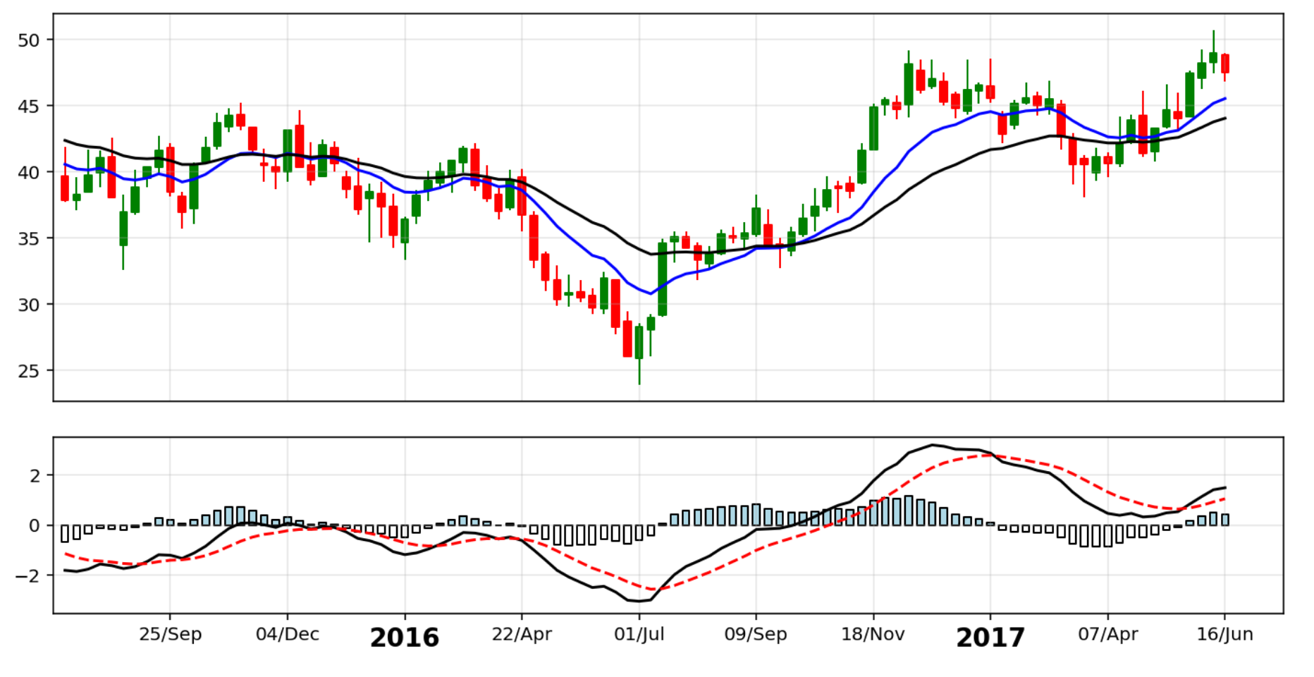
Using Matplotlib and Gander to create weekly stock charts
Let’s again say we have a Pandas DataFrame of a stocks data and we want to make a chart of a subset of the data data. Only this time we have weekly data. Our DataFrame might look something like this:

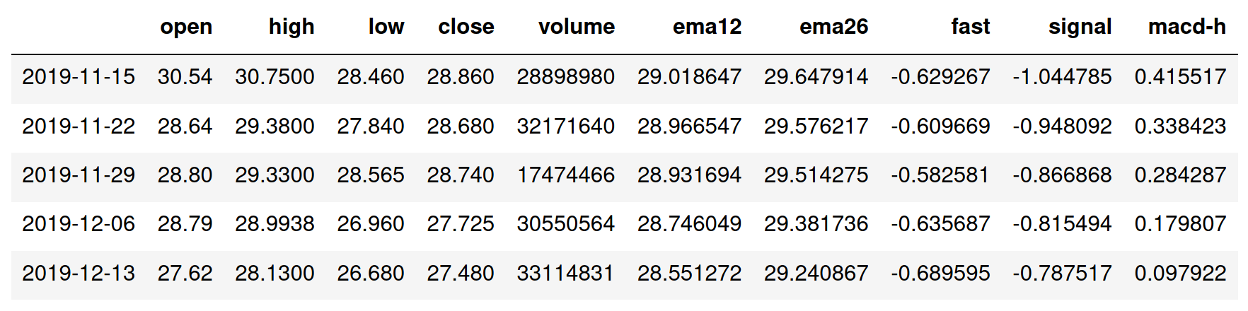
Adding indicators to the data set
df = gi.calc_ema(df, df["close"], "ema12", window=13)
df = gi.calc_ema(df, df["close"], "ema26", window=27)
df = gi.calc_macd(df, df["ema12"], df["ema26"])
This will give us something like this:
To get a subset of the data and positions on the x-axis, we can again do:
df_plot = df[-230:-130]
xpos = range(100)
The process of building the chart is the same as for daily data, except we might do different customizations to the lables on the x-axis:
Building figure and subplots
fig = plt.figure(figsize=(12, 6))
ax1 = plt.subplot2grid((3, 1), (0, 0), rowspan=2)
ax2 = plt.subplot2grid((3, 1), (2, 0), rowspan=1)
ticks, labels = gp.weekly_labels(df_plot, df_plot.index, step=10)
Customizing x-axis ticks, labels and grid
for ax in [ax1, ax2]:
    ax.set_xlim(xmin=-1, xmax=104)
    ax.set_xticks(ticks)
    ax.grid(alpha=0.3)

ax1.xaxis.set_ticklabels([])
ax1.tick_params(axis='x', length=0)
ax2.set_xticklabels(labels)

for label in ax2.get_xticklabels():
    if len(label.get_text()) == 4:
        label.set_fontsize(14)
        label.set_fontweight("bold")
Adding plots
gp.candles(df_plot, ax1)
ax1.plot(xpos, df_plot["ema12"], "b-")
ax1.plot(xpos, df_plot["ema26"], "k-")
gp.macds(df_plot, ax2, "fast", "signal", "macd-h")